

The key to good album covers lies with how the images portray: the band, their feelings, their genre and what they think you, the audience, will get out of it.
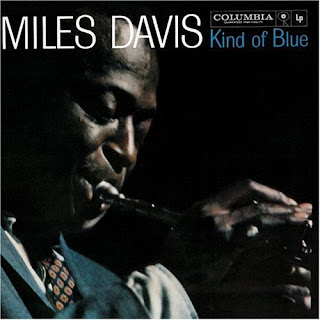
Miles Davis – Kind Of Blue
Jazz

Album CD Cover Review
Album covers usually project the mood of the album/genre/artist such as Miles Davis’s kind of blue uses dark colours to portray the slow mood of the jazz played on this album the high contrast shows his importance, they also use a spot light to show this is his ‘moment to shine’ there is hope connotated by the use of the light. The on stage organic sound can almost be heard from just looking at this cover; through the symbolism in the trumpet. The image used could also relate to the way that he is multitalented. Not only can he sing, but can also play an instrument, this could represent that he is a good live performer. This could reflect upon his success. This album was produced in 1959 so in terms of covers it was quite an early one hence the use of the artist rather than a cartoon. The clothing of the artist also suggests his individual style as well as helping the audience to identify the kind of person he is. The suit suggest he is a professional and smart character who takes care of his appearance this could then allow the audience to assume that this will be reflected in his music it also perfectly shows of the time in which this album was released as that was very 50’s. The fact that it is his face on the cover is conventional for this genre of music and helps the audience to identify him
The use of darkness behind the artists could connote a number of things including the level of emotion put into an album such as this, perhaps some slow and almost sad/moving music but it could also reflect the hardship he could have been through in his past that he is now able to use in his music.
Muse – The Resistance
ALTERNATIVE

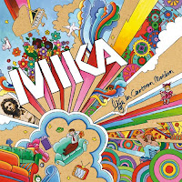
Another one being muse’s the resistance cover which is an illustration of their album, Audience should expect the unexpected
The bright colours show the ‘the mood and the alternative feel which shows what the target audience should expect from their music. This cover suggests that the band is of the alternative genre, and that the music they make maybe synthesised and manipulated, a complete contrast to the album cover from Miles Davis. This is because we don’t see an image of the band. Orange and yellow spotlight coming away from the earth connotes a stage with a representation of the band by one man in the middle of it. This could suggest the importance of one person’s involvement in the album. It could also reflect upon society’s current issues of one person impacting the world. The earth in the background shows that they are bigger than it, however the fact that it is at the centre of the album connotes that the world is the centre and every thing around it all revolves around it. Holes in their tunnel show vulnerability and the gaps in their knowledge, they are not perfect but seeing the stars shows that they still want to aim for them. Sharp shapes of the pentagons are targeting the male audience and the circular shapes could be targeting the women. The variety of the colours could reflect a number of things such as audience’s personalities; their music is ‘for everyone’ or it could reflect the alternative style of music; be ready for the unexpected.
Simplicity of the writing shows neatness, confidence and strength, so even though they are an unusual band they still have some sense of normality. This also shows that Muse are an established band that don’t need there name to sell them records, as the font is not in a large size. This could also mean that they have a big enough fan base already that they would recognize the album cover as their work.
This one was released in 2006, in that year there was another wave of cartoon themes media this was mainly due to artist like Gorillaz also the sound of synthesised strings to mind with this theme which does come up in a lot of their music.
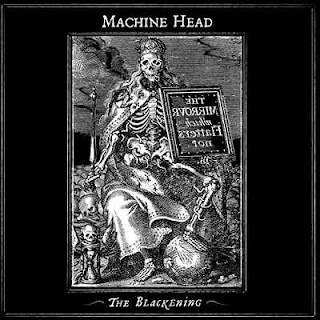
Machine Head- The Blackening
METAL/THRASH METAL

Machine head released this album called the darkening. The genres that machine head base themselves on is one of metal/heavy metal/thrash metal this is portrayed very well through their choice of album cover. The obvious portrayals of it are things such as the black and white which shows ‘the blackening’ of the world around them. The skeleton sitting on a throne of bones with smoke pouring from behind him refers to the thought of death and oblivion which creates panic and fear within. This is either a connotation of how they felt while writing the album, how they want you to feel while listening to it or both. The uncomfortable feeling you get when merely looking at this promotes their views, music and genre perfectly.
The Walrus’- Welcome To The Playground

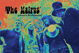
what we decided to do for our own album is convey the feeling that we thought went best with the music/ music video we have produced, something that connotes the 60’s psychedelic feel and fun and energy that was almost uplifting.
What i took from this was a huge variety of bright colours that stood out, it also had to have abnormalities to take it away from reality and make it look as if it was a dream world.
The image itself is taken from the ‘magazine photo shoot’ it shows all the band in a close group. The men looking down at the camera and also being on the end may show their control (is that the right word to use :S ) in the band and the two girls looking at each other knits the band together showing how tight they are and also the friendship that has been built.
The text chosen was seen as a very 60’s styles text type as it represents the ‘bell-bottomed jeans’ of the era, this proved in keeping with the album. The name of the band is much larger than the name of the album as this is very common though out the album art i have been researching it also shows dominance of the group who are not afraid of who they are.
No comments:
Post a Comment